There is no doubt that a great piece of art gives a home rock-star status. My problem? I’m so damm fickle (and poor). I can’t afford the oh-my-god-must-have-it prints I see in Brighton art shops. And I don’t want to risk spending money on something that I might not like in a few years. Let me introduce you to my latest discovery, Lumitrix – an art store for those in the know. They gave me £50 to go shopping wild. Here’s my guide to picking the perfect statement art (on a budget) for your home.

My Statement Art Pick
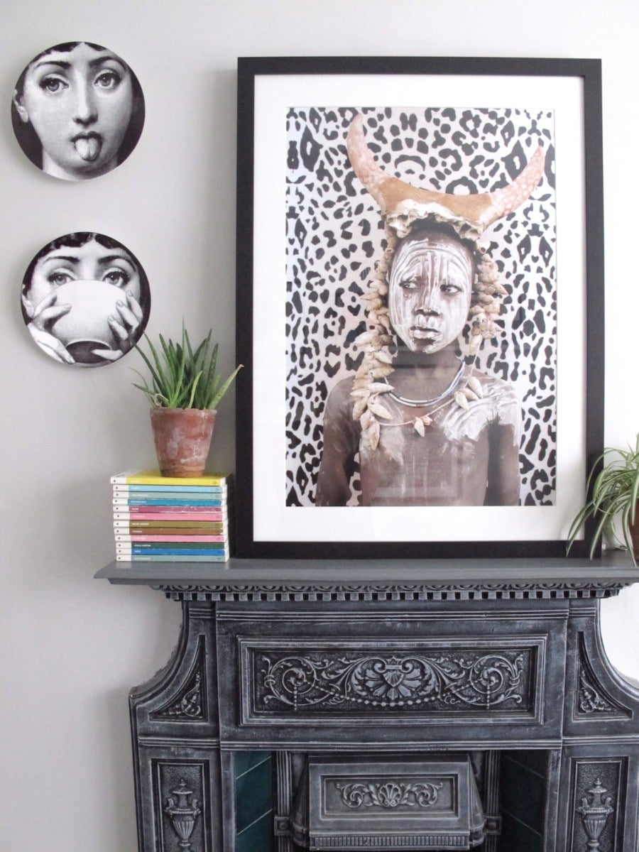
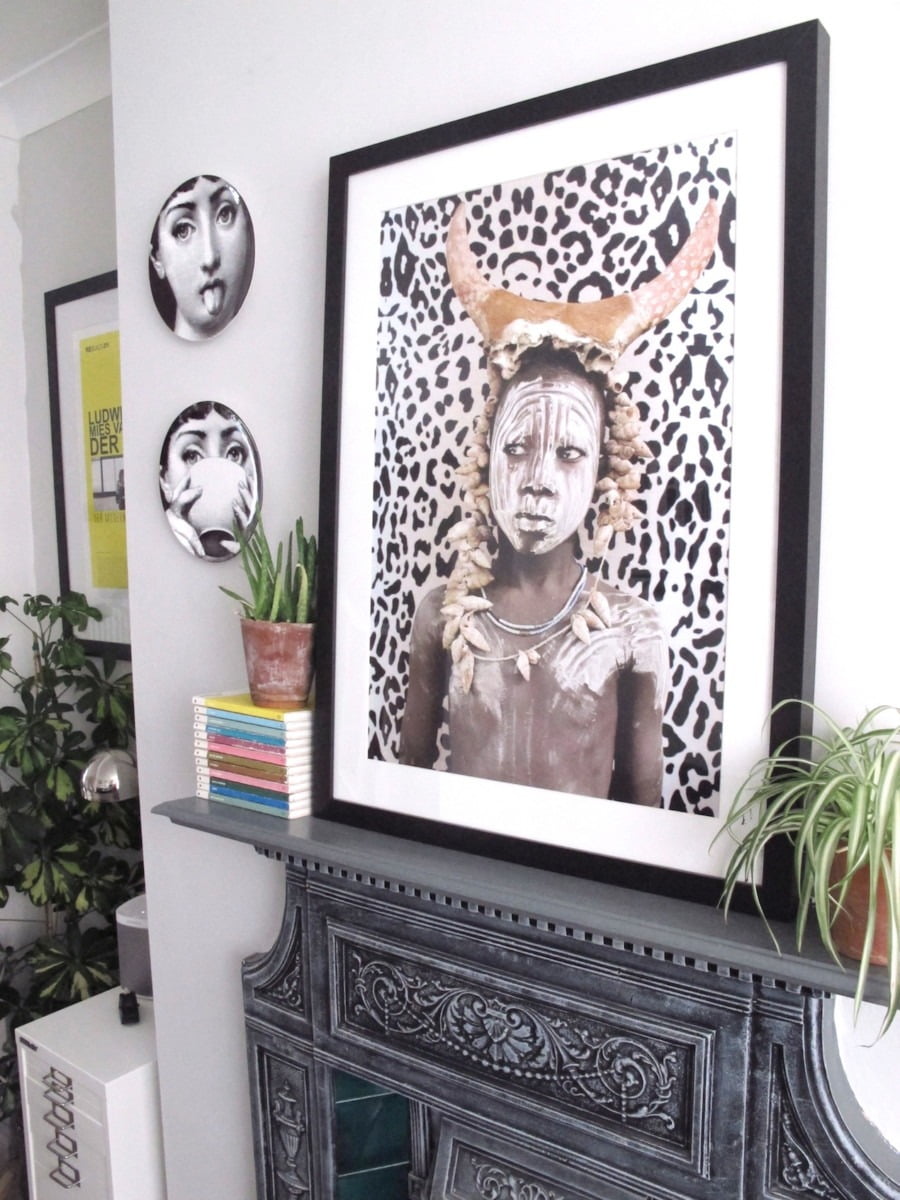
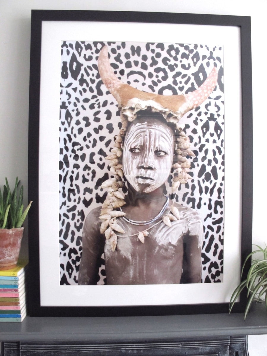
The piece I was most drawn to is this beauty above. It’s called African Boy by Matilda Temperly. There were a few things that captivated me about this photograph. I loved his piercing eyes which are so stern on someone so young. The colours and the quirky headdress appealed to the fancy-dress queen in me. Also, I loved the story behind the artist who is called Matilda Temperly – who started out researching tropical diseases before becoming a photographer. You can read more about her here.
On the Lumitrix gallery website there was 100s of pieces I wanted. I spend ages going through selecting my final piece of art. So, how did someone so flighty manage to narrow it down to just one piece?


7 tips for picking statement art on a budget
1/ Fill Your Shopping Basket: When shopping on the site pop every single piece that captures your eye in your basket. Then go back through your basket and edit down your selection. I find that much easier than trying to remember which prints I liked. All the prints in Lumitrix are a flat rate of £50 so there are no nasty surprises when you come to check out.
2/ Spot out for Limited Editions: Considering how much STUFF I have collected over the years, I find it really odd that my walls have remained very empty until recently. I’m really fussy about what I put up, only wanting something that no-one else has either picking up vintage oil painting or framing random foreign postcards from trips. The piece I selected is one of 500 limited edition prints. Considering it cost the same as some art you can pick up in Ikea (one of 100,000s) this work is a bargain buy for a limited edition art.
3/ Hidden Meaning: All the pieces I was drawn to had a personal meaning for me. These three below were in my shopping basket. Blue Morpho’ felt special because I went to Guatemala 2 years ago and have explored a lot of South America. My own photos are nowhere near as good but I did see local girls wearing the tribal markings when I was travelling around. The telephone box print reminded me of the scratched out graffiti in Brighton pub loos. Finally, I went to Burning Man twice and the dusty landscape captured by Helene Sandberg took me back in an instant. African Boy stole my heart because my first adventure abroad was in South Africa, and it was the kick start to some grand life changes I made over ten years ago.


4/ Be Drawn To Colour: If you want a piece of art to go with your home’s colour scheme, then don’t let anyone stop you. Art snobs would say this was an total no-go – but they can do one frankly. This print matches my new black and white Urban Outfitters’ living room rug. The overall colours of the piece go with my space, and bring tribal prints to my room. Lumitrix even have a search option where you can pick according to colour, artist or subject. As a colour freak, I worked backwards from there.
5/ Frame It Well: Framing your art properly will make it look like it came from a fancy art gallery. If you can afford it, take it to a proper framers’s shop. They will put in special glass that protect your art, and you can pick any colour or shape your want! Imagine the blue telephone print in copper. Siiigh! You can take the hassle-free option by using Lumitix on-line framing service where you can try out different frames until you are happy. Or you can be an utter cheapskate like me, and pick up one for £12 in your local DIY store.
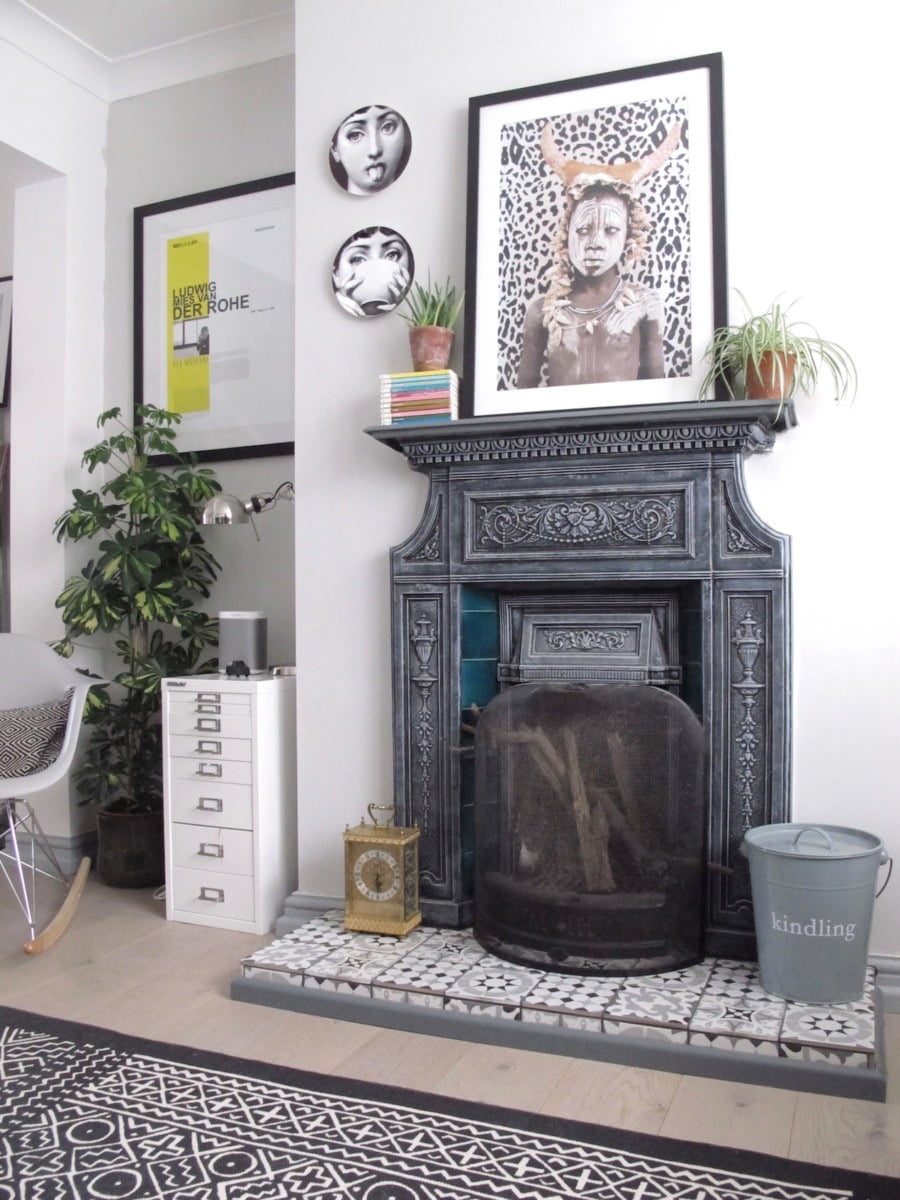
6/ Make A Clash: Okay, this is going to sound like I’m contrasting myself. Although I said yes to complementary colours – statement art should stand out in a room. How to make a statement? It can be the size of the print (a tiny tiny A2 print can make just as much impact as a HUGE piece); the patterns in the work or the overall subject matter (be as rude as you dare). In my case, although my print is black and white like the rest of the room – the style of the work clashes with etched style of my Fornasetti plates which hang right next to it. It’s almost like he is starting back at them with real attitude.
7/ Place It Well: And that leads neatly to where you hang your art. Originally, I thought I might put this piece on my growing gallery wall. But after much debate and moving around. I decided to swap the vintage mirror I had above my fireplace (you can see the before here) to give my living space an edge. BTW – I like to move art around my home as I decorate and re-decorate to keep things fresh.

There is my how-to on picking statement art on a budget while still looking like you have a rockstar’s lifestyle! However you chose, make sure you make it personal choice – that way every piece of art in your home has a story to tell.
What do you think? Did I make the right choice? Do you feel confident to shop for art on-line now with a shoe-string budget. I hope so. Until next time, much love x
•• Disclaimer, some of the products above were sent to me for review. As always, these are my opinions, my photos and my thoughts.
I often find myself willing to purchase some art piece online, but more often than not, I just don’t feel the same connection with the piece, I would feel if I saw it in real life. Do you ever have this problem?
To be honest No. I know what I love and like for my walls. I do get stuck with framing though.