Today, I want to show you how to embrace this seasons hot trend for urban botanical prints using images from my latest shoot for Good Homes Magazine. As I know how much you love to learn about my job, I’ve also included behind-the-scenes info on how a cover shoot works.
How To Decorate With Botanical Prints This Summer
One of the best part of my job when styling for magazines is to translate the latest trends into an interior look that you will love. In Spring, I was asked by Good Homes Magazine to style a room set for their cover shoot in one of the biggests trends for 2018 – botanicals prints with an urban twist.
From indoor gardens, to faux plants to leaf prints – our love of bold botanicals is a trend that is here to stay. And it was one look that I was excited to style up, with a twist of lavender and lemon to bring this look up to date for 2018.
In this post, I’m going to talk you through how I styled this living room, and I’ll share my styling secrets from behind-the-scenes on a cover shoot.
Finding Inspiration At The Press Shows
When I’m asked to style a cover shoot, I do a lot of research on the trend in question to find out how to make it feel fresh and relevant. I start by visiting the Spring Summer 2018 press shows hosted by the high street stores to discover what looks are going to be big for the following season.
The press shows for John Lewis, Habitat and Marks and Spencer was filled with soft botanical prints in shades of green proving it was going to be a huge trend this Summer.
At the shows – shades of green were mixed with yellows, pinks, teal and greys. After a conversation with Good Homes, we decided to focus on creating a living room cover shoot which was filled with these colours.

Sourcing Botanical Prints
In the run up to the shoot, I spend hours hunting down every type of botanical print. I’m looking for palms motifs on cushions, fern prints on rugs, leaf print art, vases in tones of green and yellow. Then, I stumbled across this cabbages print from Surface View – which was so perfect, I ordered it in for this room set.
As with all shoots – there is one item of furniture that is the linchpin of a shoot. The one item I have to have as a stylist. In this case, it was this soft green linen sofa caught my eye at Marks and Spencer – and it was the starting point for my design.
Starting With A Moodboard
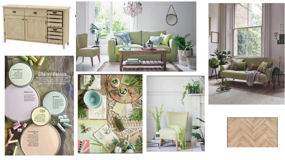
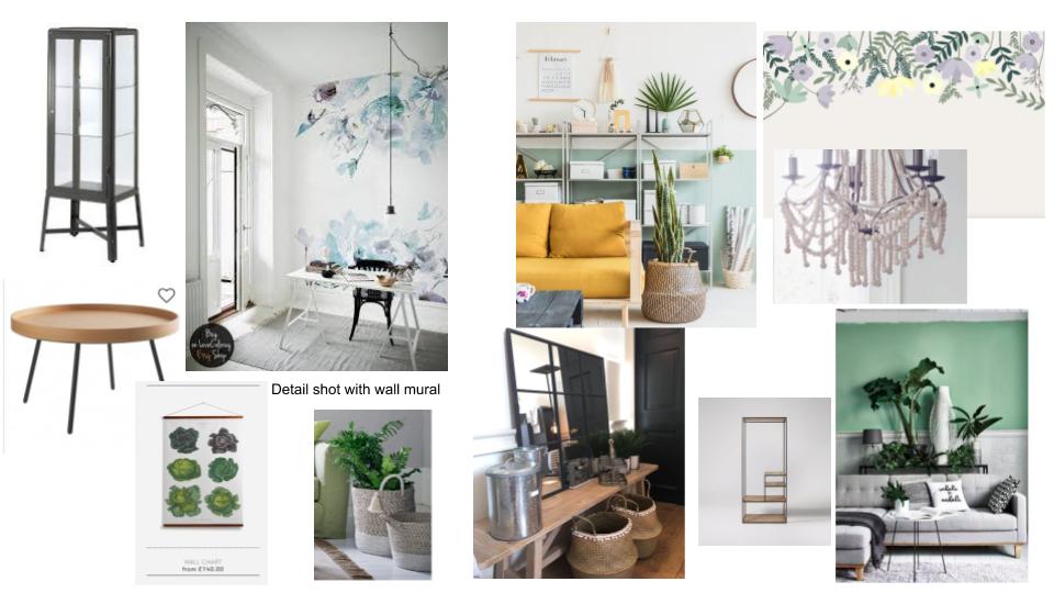
Once I have got a concept in mind, I created a moodboard to show the editor. This is where I collated all my ideas together along with paint choices, floorings and furniture picks.
When gathering my ideas at the moodboard stage, it became obvious that lavender worked brilliantly with this botanical trend. As well as pale woods and fern prints. From the latest range at Loaf, I found this apple create sideboard from their new collection – which was perfect to the set.
 This is of my part of my mood board.
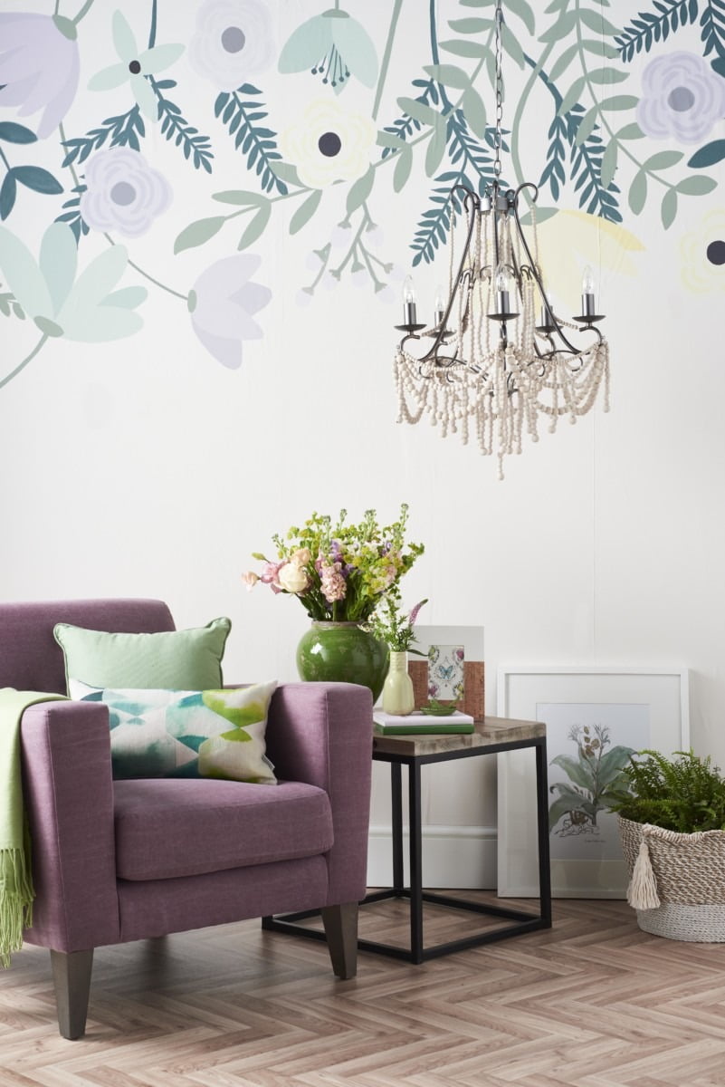
Lavender is a difficult colour to use in a living room without it looking too girly – or like a bedroom. My way of getting around this was to paint only half the wall in lavender tones, and then I had a wall mural made bespoke for the shoot from Murals Wallpaper in lilac, green and pale yellow hues. I then added to my mood board industrial style chunky furniture with black legs and wooden details to give is an urban look suitable for a modern home.
The images on the moodboard are a mix of items seen at the shows and inspiration from Pinterest.
Once the design has been approved by the magazine, I spend about three weeks call in all the props from the in-house press offices and from small independent shops.
Meet The Styling Team
It’s up to the stylist (that’s me) to organise everything – from the set design, to the delivery of the props, to booking the photographer, location and assistants. Most of my job is about the planning stages – as getting this be right is key to the shoot going smoothly.
The cover was shot on location in a London studio and we have one day to set up two covers, and then one day to shoot them (and pack up again).
On the first day, I have a set builder to help me decorate the sets. I have three assistants to help me unpack and then pack up all the boxes and boxes of props.
Day two is where the magic happens. The photographer, Andrew Boyd, and Jess Taverner from the magazine come on the shoot, and together we start photographing the sets.
We send off the images as they are done to the editor of the magazine for approval. We have to work quickly and fast as we have nine shots to do in one day – as well as pack up everything and decorate the studio back to white.

Curating Corners
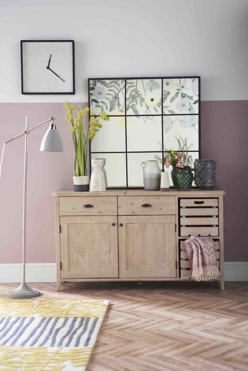
As well bringing botanical prints to the pages of Good Homes Magazine, I also love to bring in other micro trend that I know readers will not have seen before. One here is the herringbone flooring – this is a huge flooring trend for 2018. This one above from Lifestyle Floors complemented the colours in my set.
The other trend that I popped this chandelier made from wooden beads. I’ve only seen lights like this in very expensive shops, and this is the first high-street affordable version I have discovered from Mark and Spencer. So I had to feature it – as it is such a great buy.

Once the main shot is done about lunchtime on the second day, my three assistants start breaking down the set. And I concentrate on shooting the smaller detail shots. We work so quickly! The details are my favourite element of a style shoot as it is where you can be most creative.
I got to feature this fab crittall mirror from Next above – and I reflected the motif wallpaper in it. Then I matched the metal frame of the mirror with the black Station wall clock. It’s these little touches which makes these shots all work together when laid out in the pages of the magazine.
The End Result
The editor said this was one of her favourite covers in the magazines – which was a huge compliment. It was great to show this Botanical look in a new and fresh way – the soft lavender colours are ideal for Summer. And in each shot there are lots of ideas to take away in your own home.
Have you learned a little more about how a shoot works? I’d love to know in the comments below.
Love
Maxine
You May Also Like
Decorating WIth Skirting Boards

Beautiful, fresh, clean looks. Thank you for the inspiration!